Having your WordPress website looking good on every kind of device is essential. Today I give you four ways to test your WordPress website on different devices so that you can be confident your blog looks fantastic wherever your readers are.
Not long ago, the only screen size we needed to worry about was the desktop computer.
Now there are so many different types of screen size ranging from huge television screens down to the smallest mobile.
If you take a look at your Google Analytics, I am willing to bet that the percentage of viewers you have coming from a mobile device is at least 50%, and that number is set to grow.
If your blog doesn’t look great on a mobile, or loads slowly, then you could be waving goodbye to a substantial proportion of your potential audience.
You might be thinking, well, I chose a great theme that is known to be fully responsive on all devices, so it must look fine on mobiles.
However, once you start adding popups, GDPR cookie notices, fixed headers, social sharing buttons, and advertising, your website can become quickly cluttered and unusable.
I have one of the smallest phones you can get. I can’t be the only person who still owns an iPhone SE. I also can’t be the only person who has had to click away from a website cluttered with popups, advertising and social icons covering so much of the screen that I couldn’t be bothered to hang around.
We must cater for all screen sizes. But how do you know how your blog appears on the different devices?
The good news is that it doesn’t have to be complicated to test your WordPress blog on mobile at all.
Let’s run through your options.
Testing your WordPress blog on a mobile phone
Your first option is to test your blog on your own mobile. If you don’t have a big phone, then you have an advantage, because you can get a better picture of how your blog looks on smaller screens.
Open your website on your mobile, and make sure that the text is big enough to read.
I like to go for at least 16px-18px on mobile.
Make sure that the heading fonts aren’t so big such that they have to wrap onto too many lines.
If you have a great theme, you can edit the font sizes within the WordPress customiser. Go to Appearance->Customise, and there should be a ‘Typography’ section or something similar.
If your theme doesn’t allow font sizes to be changed, you could add some CSS in the Additional CSS box within the WordPress customiser.
Try adding this CSS to change your font sizes for mobile. Experiment with the font-size numbers to suit you.
@media (max-width: 768px) {
 body { font-size: 18px;} h1 { font-size: 30px; }  h2 { font-size: 28px; } h3 { font-size: 26px; }
}
Some popups such as GDPR and and opt-ins only appear for new users, because they are based on the presense of a cookie.
Our next test will be as an anonymous user; that way, we can see if any popups or cookie notices stop new visitors from viewing content.
Open an incognito tab on your mobile browser. For the Google Chrome app, tap the tabs icon at the bottom of the screen, then click the icon on the top that looks like a man in a hat and glasses.

On Safari click the tabs icon and then choose Private.
Open your website either on the home page or on a blog page.
How does your blog appear? Do you have anything covering the cookie notice stopping people from clicking to accept?
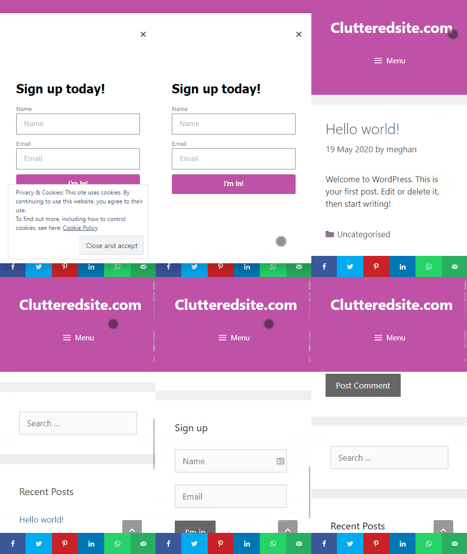
Try scrolling. Is there enough reading space? A fixed header combined with fixed social sharing buttons on the footer or some ads can reduce the content area and make it hard to read.
Here is an example of a webpage where you can’t see the content because there are too many popups.
Due to the fixed header and the fixed sharing buttons in the footer the viewing window becomes too small.
Test your WordPress blog in the customiser
While you were editing the font sizes, did you notice the device icons at the bottom of the customiser?
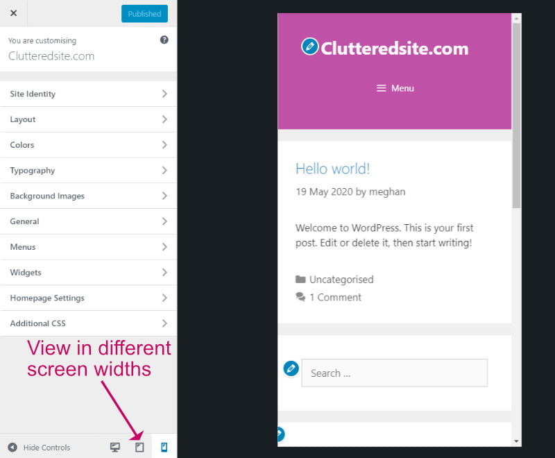
The options are quite basic, you can only choose desktop, tablet and phone, but it is a quick way to see how your site looks on standard screen sizes.
If you see problems, you can act immediately by changing options and previewing the effect before you save the changes.
Using Google Chrome browser to test different screen sizes
The options available within the WordPress customiser for testing your website in different screen sizes are quite limited.
You can check many more screen sizes using the tools available in your desktop web browser.
For this tutorial, we will be using Google Chrome browser, but you can do a similar exercise in Safari too.
Open up your blog in Google Chrome. An incognito window (Shift+Ctrl+N) is best because we will get to see how your blog behaves for new visitors.
Open the developer tools (Shift+Ctrl+I) or right-click and choose Inspect.
Click on the Toggle Device icon on the top left of the screen or use the shortcut keys Ctrl+Shift+M.
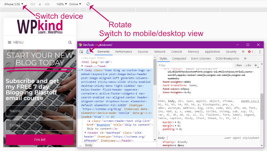
In the top toolbar, you can select a variety of different devices, in portrait or landscape mode. If the device you want to test on doesn’t appear, choose the Edit to select more options.
Test your WordPress blog using an App
The last (but not least) option is to test your mobile using an app.
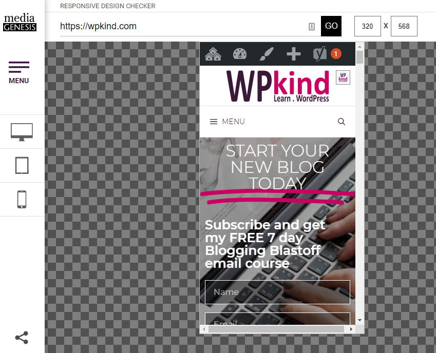
Responsive Design Checker was initially created by a website design company for their own use, but they have kindly made it publicly available for anyone to use
Responsive design checker is a free online tool that lets you view your website in a multitude of different desktop, tablet and phone sizes. Browse around your site checking every page on each screen size as if you were seeing it on the device itself.
To check your website, all you need to do is paste in your website URL, and you can test on any device using the icons on the left.
Final thoughts on how to test your WordPress website on different devices
Today I have given you four options for testing your blog on different screen sizes. You don’t need to buy every device available to have your blog looking good on all types of phones and tablets. There are lots of free ways to test it yourself without having to be a technical genius.
Don’t make the mistake of just testing your blog once and calling it good. Your blog is always changing, so you need to check regularly to ensure it still looks fantastic at all times.


