In today’s blog post we talk about choosing and using a custom font on your WordPress blog.
Fonts are a big part of your website design. Choosing the right font is one of the important decisions you will need to make in the design phase of your blogging journey.
In this post, I have some handy tips to give you for choosing the right font for your blog plus choosing an accompanying font that works well together.
I also have a handy hack for discovering fonts from other sites. If you have ever wondered what font your favourite blog is using, then keep reading to find out!
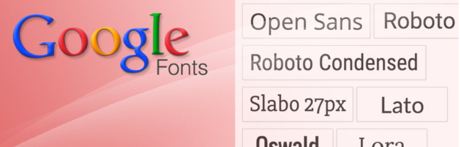
Google Fonts is the most common font library. I recommend using Google Fonts because many themes support it, making the technical aspect of loading the font onto your site much easier. If your theme doesn’t support Google Fonts, I have you covered too.
I finish up with a very important point about loading speed. The key takeaway is that the more fonts you load up on your site, the slower your site will become, so do keep that in mind.
What are fonts?
Fonts are the typefaces used to show text on a website. All browsers come with default fonts that you can use without having to do anything special. Before custom web fonts were allowed, all websites were restricted to using only browser fonts.
Default fonts include:
- Arial
- Courier
- Verdana
- Helvetica
- Georgia
- Times New Roman
Now, with the support of web fonts, it is now possible for browsers to use any font a webserver chooses to send. Many fonts are free, but you can also pay for premium fonts, or even make your own font if you have the expertise!
Let’s delve a little deeper into what makes a font.
Fonts can have size, weight and style.
What are fonts?
Fonts come in one size when you download them, but you can change the size either in the theme’s settings or via CSS.
You can often change the font size globally in your theme settings, but if you can’t do that, you could add some CSS in the Additional CSS section of the WordPress Customiser. Here I set the heading 1 element to be 48 pixels in size.
h1 { font-size: 48px;
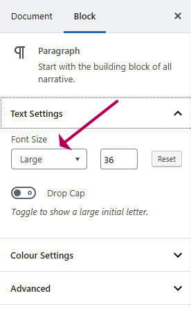
}You can also change the font size of an individual block:
- Select the block
- Head over to Block Settings and select a different the Font Size
This text is much bigger!
How to choose a font for your WordPress blog
Some fonts come in various weights (such as regular, bold) and styles (such as italic).
The font-weight defines how strong the typeface appears, where 100 is the lightest and 600 and above is the strongest.
This is some bold text with a font-weight of 600.
Heads up: You can’t select a font-weight for a particular HTML element unless that font-weight is available to use.
Your theme may already have fixed the font-weights and styles that will be used for various HTML elements. Some themes, such as GeneratePress allow you pick your own weights and styles.
If you want to use a really bold font of 900 for example, to use it, you would first need to make sure that font-weight has been selected for use, either in the customiser or as part of the theme’s configuration.
How to choose a font for your WordPress blog
Choosing a font can be a difficult decision to make. Here are a few rules that I always bear in mind when selecting fonts:
- Don’t use more than two fonts on your website
- Headings can have different fonts from body text.
- A serif font for headings and non-serif for body text can work well.
- Using different font-weights can add variety. Instead of going for a different heading font, simply change the weight instead.
- Use contrast. A higher weight, such as 600, for headings, and a low weight, such as 300 or 400 for body text make headings stand out.
- The main font for body text should be easy to read on all screen sizes. Italics are not easy to read. Clean and simple is best.
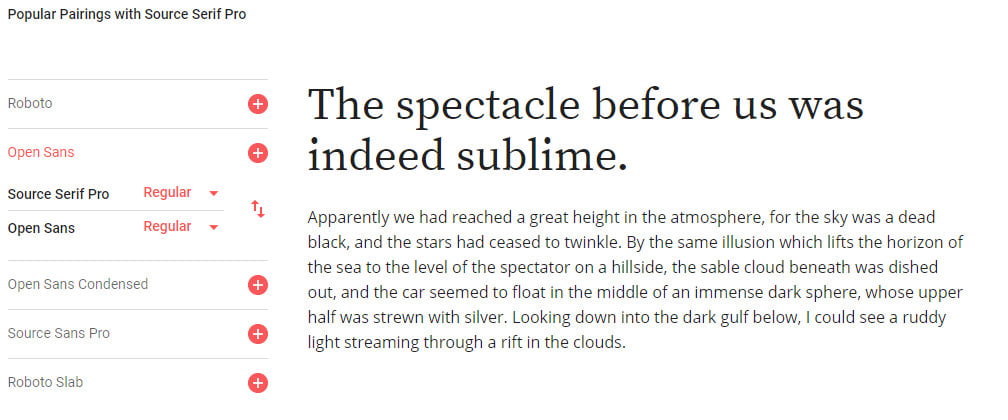
Google Fonts is a great place to choose a font.
What is great about the Google Fonts site is that once you have chosen the main font, it will suggest a font pairing.
Here I picked the font inherit for headings. Google suggests that Roboto, Lato, Oswald, inherit and Raleway would all look good with it, and shows me an example too.
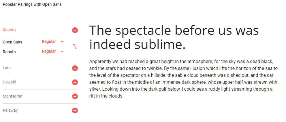
Here is a serif font paired with inherit, which is a sans-serif font, A serif is a tiny stroke that appears on the end of a larger stroke. Non-serif fonts, as their name suggests don’t have the extra stroke.
Serif fonts for headings tend to look good with sans-serif body text.
Where to find and use custom fonts
I have already mentioned Google Fonts as a great free resource for fonts. Here are some other sites too.
- Font Squirrel
- Font Space
- My Fonts
- Dafont
- If you have an Adobe Creative Cloud subscription you can use Adobe Fonts.
I thoroughly recommend Google Fonts as a resource, because these fonts are much easier to use on your website. You don’t have to download them and fiddle around with CSS code. Many themes integrate with Google fonts already, and it is a simple case of just selecting what you want.
If your theme does not support Google Fonts, there is a free plugin you can use instead. We will cover that a bit later.
How to find out what font another website is using
Have you ever arrived at a website and thought, wow, I really like the font!
Unless you have a VERY keen eye for fonts there is no visual way of telling which font it actually is.
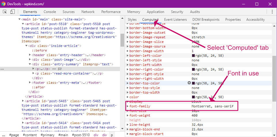
Here is a very neat trick for finding out exactly what font is in use.
You will need Google Chrome browser for this, you can download it here if you don’t have it.
- Navigate to the website with the great font using your Google Chrome Browser app.
- Position your mouse pointer directly on the text.
- Right-click and choose Inspect from the context menu to bring up the developer tools window.
- Click the Computed tab in the right panel
- Scroll down to font-family
- Make a note of the first font name. Here it is inherit.
If you can see that there are other fonts are in use, such as in the headings, simply point your mouse at the heading and repeat the same process.
How to use a Google font on your WordPress blog
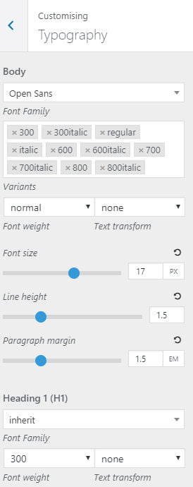
If you have picked a great theme with a high level of customisations then you will be able to select the chosen Google font directly with the WordPress Customiser.
Here is a quick tutorial of how to do it in GeneratePress.
- Go to Appearance->Customise
- Click the Typography tab
- Select a new font for the Body element from the list.
- Optionally add/remove a selection of weights and styles for the font
If you don’t have GeneratePress or a theme that supports Google Fonts, there is a handy plugin you can use instead – WP Google Fonts.
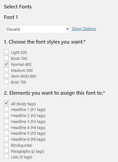
- When you install and activate the plugin, you will find a new tab on the admin screen called Google Fonts.
- From there you can select your Google font and then specify which elements should use it.
- Here I have selected All because I want the Oswald font to be used everywhere.
Custom fonts and loading speed
I couldn’t finish this post without mentioning website speed!
Many of you will know how keen I am on site speed. I have a post dedicated to improving site speed here: 14 Super Easy Ways To Speed Up WordPress.
In my post on speed, I mention how too many fonts on your site can slow down loading time.
Each font weight you select represents a separate font file that has to be downloaded from Google into your site visitor’s browser. The more weights and styles you have, the more files that need to be downloaded, and therefore the slower your site becomes to load.
If you have the option in your theme’s settings, or you are using WP Google Fonts, or similar plugin, only tick the font weights that you will actually be using on your blog.
For example, at WPKind I use a Google Font called inherit, I use a font-weight of 600 for headings and 400 (regular) for body text plus a regular italic, so I have only selected those weight sand styles in the Typography options.
Wrapping up
In this post, I have given you some helpful tips on choosing a font for your blog and then taken you through the technicalities of using your dream font on your blog
A fantastic font can make your site design look amazing. Keep it simple, using one or a maximum of two different fonts.
If your theme does not support Google Fonts, there are several plugins that can supply that functionality instead of which WP Google Fonts is recommended.
With each different font style you select the more you slow down your website, so don’t select more font styles that you are going to be using.